

PURI SARON SEMINYAK
Role: UX/UI Designer
Tools: Figma, FigJam
Duration: 06/2025 - 07/2025
Type: Individual Project
Puri Saron Seminyak is a beautiful beachfront hotel in Bali with an authentic tropical atmosphere.
For this concept redesign, I explored how the hotel’s online presence could better reflect its warm in-person experience through a modern, mobile-friendly interface and a more trustworthy booking flow.
BACKGROUND
How can a hotel’s website make travelers feel the warmth of Bali before they arrive?
CONTEXT
Puri Saron Seminyak is a beachfront hotel in the heart of Bali — known for its tropical atmosphere, prime location, and warm hospitality. As part of a concept redesign, I explored how its online presence could better capture this spirit — offering travelers a smooth, modern, and trustworthy experience that matches the feeling of being there in person.
PROBLEM
The current website is hard to trust and navigate — especially on mobile. Important details like rooms, amenities, and contact information are not structured clearly, and the booking flow often leads off-site, making users hesitate to confirm reservations. As a result, the hotel risks losing potential guests before they even complete a booking.
SOLUTION
A full concept redesign of the Puri Saron Seminyak website focused on:
Creating a modern and responsive interface optimized for all devices
Designing a trustworthy and transparent booking flow
Highlighting the hotel’s visual identity and warm tropical character through photography, typography, and layout
Encouraging direct bookings by improving clarity and user confidence
BEFORE THE REDESIGN
To better understand the hotel’s current digital presence, I analyzed the existing Puri Saron Seminyak website.
While it provided essential information, some pages showed inconsistent loading of images and minor technical issues, which could interrupt the user journey. The overall interface felt visually dated and lacked a clear hierarchy, especially on mobile devices. This became the foundation for identifying areas of improvement in my redesign.


Disclaimer: This is a concept redesign project created for educational purposes.
Puri Saron Seminyak is a real hotel, but this project is not affiliated with or commissioned by the brand.
COMPETITIVE ANALYSIS
After reviewing the original website, I wanted to see how other Bali hotels attract and engage visitors online. To answer that, I explored several competitors to uncover what makes their digital experience trustworthy and easy to navigate.

Tap image to view in details
KEY FINDINGS
-
Several competitors redirect users to third-party booking systems or rely on PDF menus, which disrupt the booking journey and make navigation less intuitive.
-
Websites with clean layouts, consistent branding, and high-quality photos (like Hotel Indigo) feel more reliable and modern, while others lose credibility due to dated design and cluttered visuals.
-
Most websites have little to no live chat, map integration or visible social proof, limiting user engagement and making the experience feel static and one-directional.
USER INTERVIEWS
When booking feels uncertain, travelers look elsewhere
To understand how users experience hotel websites and what builds (or breaks) their trust, I conducted 5 user interviews with travelers aged 25-49 with different backgrounds. Participants were asked to explore the current Puri Saron Seminyak website and share their thoughts on usability, booking flow, and first impressions.
Across all interviews, I discovered that even small points, like, unclear pricing, hard-to-find buttons, or redirect pages, can lead users to abandon direct booking and return to third-party platforms.
RESEARCH GOALS
Understand how travelers search, compare, and book hotels online.
Identify what builds trust and what causes hesitation on a hotel’s website.
Explore how users perceive design, clarity, and booking flow.
Validate key pain points through real user behavior and feedback.
METHODS
5 interviews with travelers from Germany, Italy, and the UAE.
Usability tasks focused on browsing rooms, checking amenities, event packages and completing a booking.
Affinity mapping to identify recurring themes and user frustrations.
KEY FINDINGS
-
Users felt skeptical when websites looked old, inconsistent, or redirected to external booking platforms. These moments instantly reduced trust, making people feel the site was less safe or even a scam.
-
Participants valued transparent pricing, visible reviews, and simple navigation. When information was easy to access and consistent across pages, they felt confident enough to book directly.
-
A clean layout, high-quality photos, and responsive design made websites feel reliable and professional. Even small improvements, like, faster loading, working buttons, and intuitive steps - had a big impact on user trust
THE STRATEGIC BREAKTHROUGH
Original approach:
The existing Puri Saron Seminyak website presents essential hotel information and booking options, but several elements — such as navigation buttons and booking links — don’t always function as expected.
➡️ Result: moments of friction, reduced confidence, and hesitation to complete bookings.
Our insight:
Travelers look for more than availability — they want clarity, reassurance, and a sense of place.
They value sites that feel modern, trustworthy, and visually connected to the destination experience.
➡️ Users crave simplicity, confidence, and emotional connection when booking directly.
What if…
What if Puri Saron’s website could reflect the hotel’s hospitality online — combining trust, beauty, and simplicity in every interaction?
USER PERSONA
Finding the perfect stay: Victoria’s story
Research showed that travelers often hesitate to book directly when a hotel website feels unclear or outdated. Victoria, a 28-year-old graphic designer from the UAE, represents users who value simplicity, trust, and a seamless mobile booking experience.

Tap image to view in details
How might we help users feel confident and secure when booking directly through the website?
How might we improve the booking experience so it feels quick and effortless for users?
PROJECT GOALS
From the HMW, I defined clear project goals — aligning user needs with business objectives to guide the design process.

Tap image to view in details
USER FLOWS
Mapping how guests interact with the website
To explore how users navigate and complete key actions on the Puri Saron Seminyak website, I created two main user flows that reflect their primary goals when visiting the site:
Book a Room
A traveler visits the website and whats to reserve a Deluxe Room with Balcony for one person, staying from July 13th to July 15th. From the Home Page, they explore available rooms, review photos and details and proceed to the booking form. The flow highlights how clarity of pricing, room information, and a trustworthy checkout process support confident bookings.
Contact the Hotel
A user wants to get in touch with the hotel to ask about services or availability. From the Home Page, they access the Contact Us Page, locate contact options (form, phone, or email), and send an inquiry. This flow focuses on accessibility, ease of finding contact details and reassurance that messages are received.
LO-FI SKETCHES & MID FIDELITY
After testing different ways to visualize the booking process, I found that this version delivered the smoothest and most natural flow for users. This version provided the best balance of clarity, simplicity, and usability for the hotel’s booking flow, so I decided to continue developing it further.

HIGH FIDELITY WIREFRAMES
I built high-fidelity wireframes that combine modern structure, warm visuals, and an intuitive booking flow inspired by Puri Saron’s relaxed tropical experience.
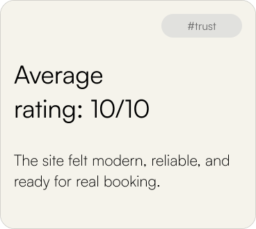
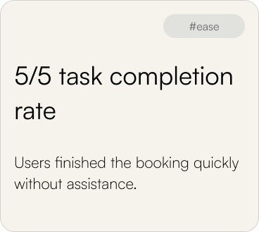
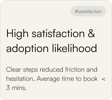
USABILITY FEEDBACK
Effortless navigation that captures the hotel’s warmth online
Usability testing with 5 participants focused on the key task: booking a Deluxe Room with Balcony for one person from July 13–15.
All users completed the task smoothly and described the experience as intuitive, fast, and trustworthy. Feedback highlighted the clean design and clear structure, with small suggestions like adding more visuals, payment options and reviews.
SUCCESS METRICS
ITERATION PRIORITIES
Overall, users found the redesigned website intuitive and easy to navigate, but small enhancements were made to improve engagement and clarity.
Payment Options Expansion
Some users preferred having more flexibility when confirming their booking. I introduced additional payment methods - PayPal and Apple Pay to make the process more convenient and trustworthy for different user preferences.
Enhanced Location Section
One participant suggested improving the location section by adding visual, infographic-style icons to make it more intuitive. I integrated simple icons and supporting visuals to easier absorb the information.
Homepage Slideshow
Participants wanted to see more of the hotel’s atmosphere before booking. I added a slideshow of high-quality images on the homepage to create a more immersive first impression and highlight key experiences.
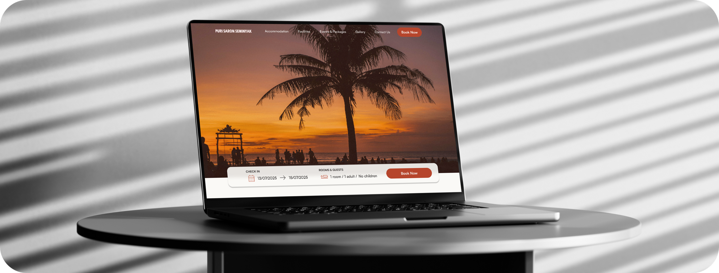
FINAL DESIGN


FINAL PROTOTYPE
The prototype phase focused on translating the refreshed brand identity of Puri Saron into a smooth, hotel-specific digital experience. Instead of just optimizing usability, the goal was to recreate the resort’s atmosphere online warm, tropical, and effortless, so the booking process reflects the comfort and clarity guests expect from their stay.
Book a Deluxe Room
From the Booking Page, users can quickly select dates, view room details, and complete their reservation all in one flow. The process feels simple, clear, and reliable, helping guests book their stay without any issues.
REFLECTION
What I Learned:
Designing for a real hotel website helped me deeply understand how even small design choices, from layout to color balance, that can significantly influence user trust and decision-making.
I realized that users instantly form opinions about credibility. If a website looks outdated, loads slowly or feels inconsistent, they simply lose confidence and leave.
Reviews, visuals, and connected social media links play a huge role in shaping user trust, helping guests feel the brand is real and transparent.
If I Did This Again:
I would reach out to the hotel directly to get authentic photos, short videos and detailed brand materials to create a more realistic, visual story.
I’d conduct deeper research and usability testing with real guests or travelers to find out booking motivations, expectations and pain points more in detail.
I would include a clear language-selection feature to make the website accessible for international visitors and improve overall inclusivity.
I’d explore how design patterns, transparency and trust signals can encourage users to confidently book directly through the website instead of relying on third-party platforms.