

NEWROOTS
Role: UX/UI Designer
Tools: Figma, FigJam
Duration: 08/2024 - 03/2025
Type: Individual Project
Many people who’ve moved abroad will agree - it’s an exciting, but it can also feel so overwhelming!
Between cultural differences, loneliness, and the stress of starting fresh, it’s easy to feel unrooted. NewRoots helps newcomers restore balance by offering yoga, sound healing, and authentic gatherings that spark connections and create a true sense of belonging.
BACKGROUND
People often struggle with some challenges when they move to a new place
CONTEXT
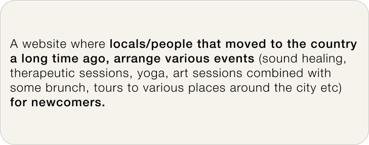
Moving to a new country is often seen as exciting, but in reality it can be stressful and complex. Beyond the paperwork and logistics, newcomers face cultural barriers, loneliness, and uncertainty about where to find reliable information or genuine social support.
PROBLEM
Most relocation resources focus only on practical needs like housing, visas, or insurance. While essential, these don’t address the emotional challenges of starting fresh - stress, isolation and the lack of meaningful connections. As a result, many newcomers struggle to adapt smoothly, often feeling unrooted in their new environment.
SOLUTION
To make adaptation more supportive and human-centered, I designed NewRoots - a platform that combines wellness practices with authentic local experiences:
Stress relief through wellness ➡️ yoga, sound healing, and guided activities to nurture emotional balance.
Belonging through community ➡️ networking brunches, social events, and cultural gatherings hosted by locals.
Together, these experiences help newcomers ease the transition, connect with people, and establish a true sense of home.
COMPETITIVE ANALYSIS
I looked at how other relocation and community platforms support newcomers to see what they already offer and why people still struggle during the adaptation process. This helped me better understand the landscape and the gaps newcomers continue to face when moving to a new country.

Tap image to view in details
KEY FINDINGS
-
Forums and social features are common, yet the sense of belonging is limited. Many platforms focus on information-sharing rather than emotional support or authentic connections.
-
Most platforms provide information links (e.g., visas, rentals, insurance) but rarely offer direct assistance. This leaves users juggling multiple sites and struggling to piece together what they need.
-
Several competitors have old articles, inactive social channels, or interfaces that don’t feel modern. This weakens trust and makes it harder for newcomers to rely on them.
USER INTERVIEWS
Moving abroad isn’t only about visas and checklists - it’s about how people rebuild their lives and connections from scratch
To better understand the real challenges newcomers face, I conducted 4 interviews with people who had recently relocated to different countries. Their stories revealed not only practical struggles, but also deeper emotional needs that existing platforms rarely address.
RESEARCH GOALS
Explore the main challenges people face when relocating.
Understand how they adapt to a new lifestyle and build routines.
Identify pain points related to cultural differences, emotional well-being, and loneliness.
Uncover unmet needs that could be supported through community and wellness.
After the interviews, I synthesized insights with affinity mapping, which helped me surface recurring patterns and pain points that weren’t obvious at first.
KEY FINDINGS
-
Participants often experienced stress, cultural differences, and emotional disbalance during adaptation. Building a new routine and coping with loneliness were just as difficult as handling logistics.
-
Most newcomers relied on friends, partners, or online groups for advice and comfort. This shows how vital authentic connections are in helping people feel at home.
-
Around 50% of participants struggled to communicate with locals at the beginning, which made everyday tasks harder and slowed their integration process.
THE STRATEGIC BREAKTHROUGH
Original approach:
Relocation platforms mostly focus on practical information like visas, insurance etc. While useful, they rarely address the emotional and social side of adaptation.
➡️ Newcomers feel stress, loneliness, and disconnection, even when they have access to practical resources.
Our insight:
Listeners want playlists that match their activity and mood in the moment, plus simple ways to stay connected to favorite artists.
➡️ They crave belonging, emotional balance and authentic connections.
What if…
moving abroad could feel less like a lonely struggle and more like a supported journey, where newcomers could join activities, connect with locals and quickly feel at home? 🌱
USER PERSONA
Seeking connection while adapting to a new culture: Kate’s story
According to the knowledge and insights that I got from the interviews and competitive analysis, here I would like to introduce the user persona - Kate, who just moved to Italy to her husband.

Tap image to view in details
How might we make people that are moving to a new place feel more emotionally stable during the moving process or during the adaptation period?
PROJECT GOALS
From the HMW, I defined clear project goals, aligning user needs with business objectives to guide the design process.

BRAINSTORMED IDEAS
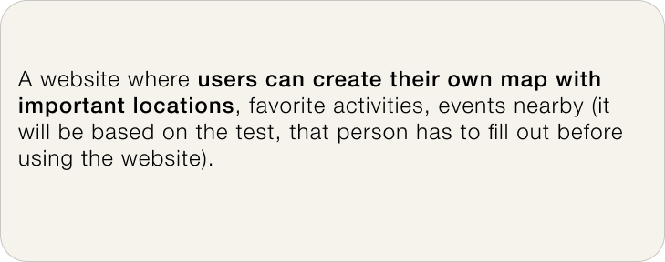
At first, I considered building a tool that helps newcomers map out favorite spots and routines in their new city. But research showed that while information is everywhere, what people miss most is human connection and emotional support. This insight led me to choose Idea 1 - a community-based platform where locals and newcomers meet through meaningful events, easing both adaptation and well-being.
Idea 1 ✍🏼
Idea 2 ✍🏼
SITEMAP
Designing the foundation for seamless adaptation
To give NewRoots a clear backbone, I mapped out a sitemap that organizes the app into its core areas: community spaces, events & experiences, and user support.
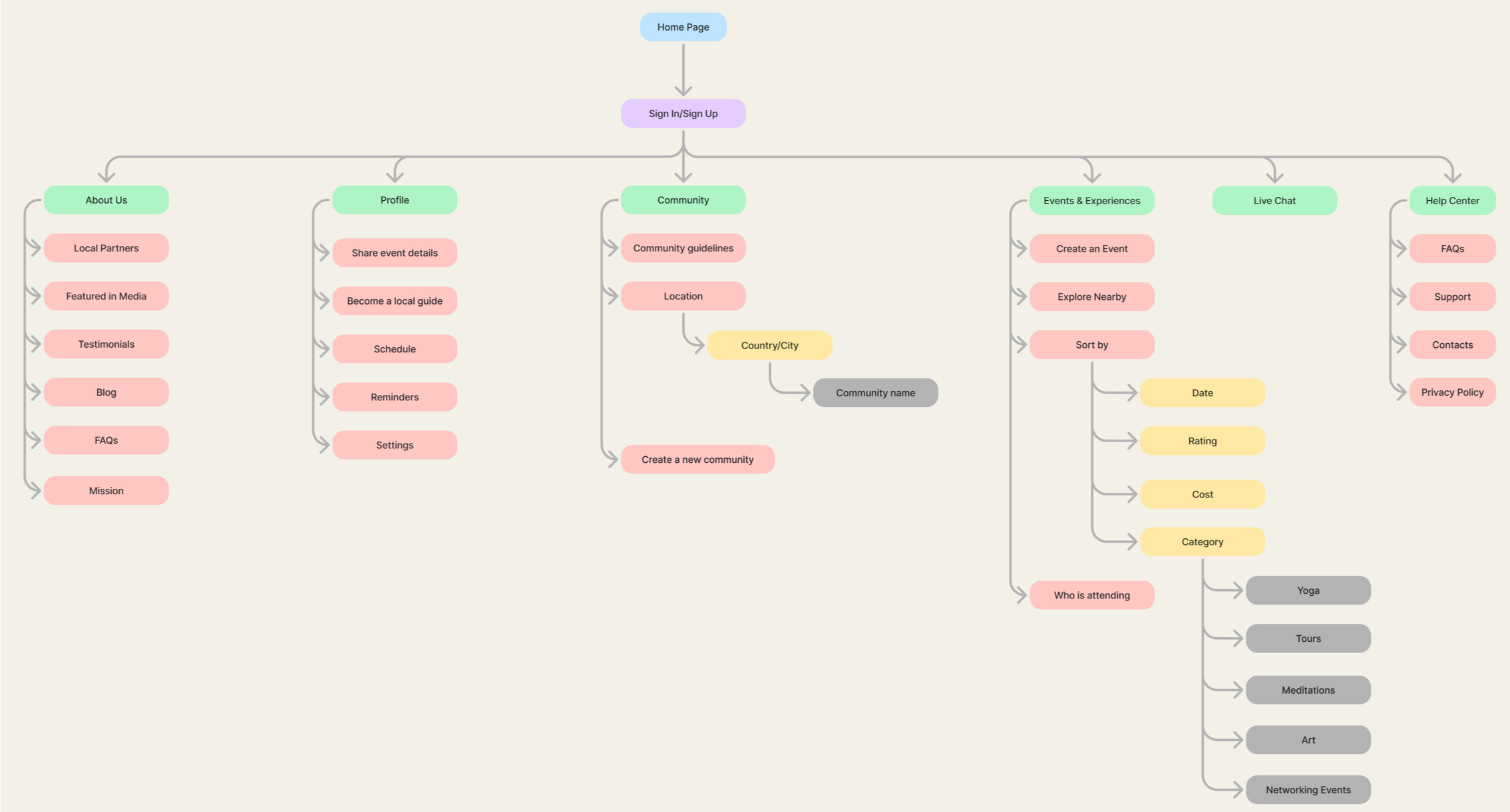
Tap image to view in Figma
USER FLOWS
Designing seamless paths to join and explore meaningful events
While the platform includes multiple sections - like profiles, communities, local partners and live chat - I focused my design process on the two most critical user journeys:
Sign In / Sign Up - the starting point for newcomers to join the platform.
Book an Event - the core action that helps users discover, join, and connect through meaningful experiences.
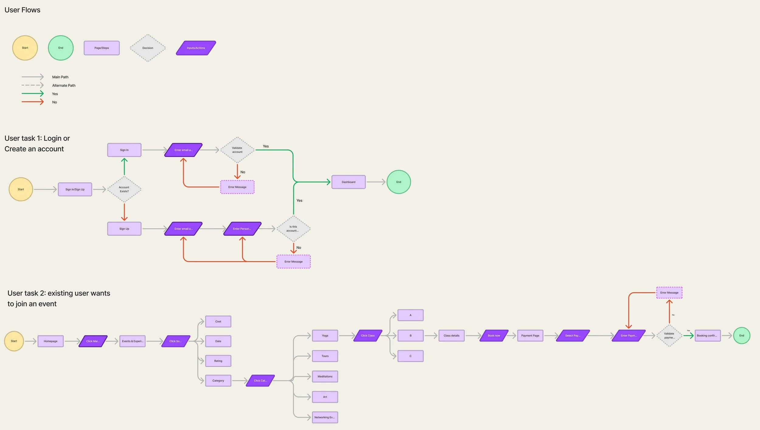
Tap image to view in Figma
LO-FI SKETCHES & MID FIDELITY
To quickly explore solutions, I sketched out two different low-fidelity versions, experimenting with layout and navigation to see which flow would better support newcomers. These early explorations guided the transition into mid-fidelity wireframes, where the structure became more defined while still leaving room for iteration.
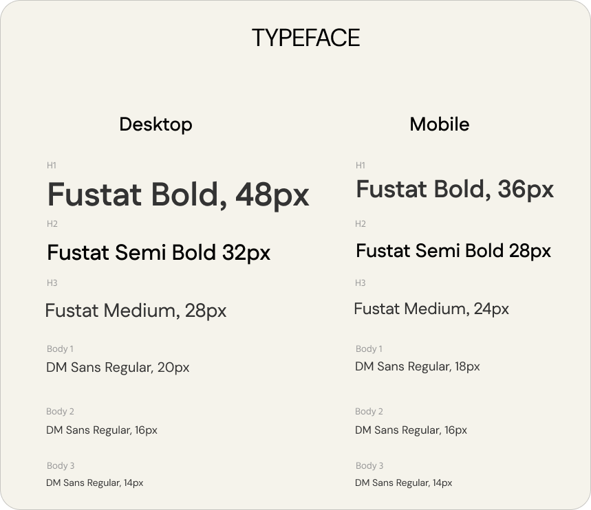
UI KIT
A visual identity rooted in community and belonging
When I started thinking about my brand values and what my platform will represent, I've come to the conclusion that I want to create a space, where users will feel warmth since they join the community, a sense of belonging. That is why every, even a small detail (meaning of each shade in color palette, history of this specific typeface etc) has a meaning of balance, belonging, community, connection and warmth.
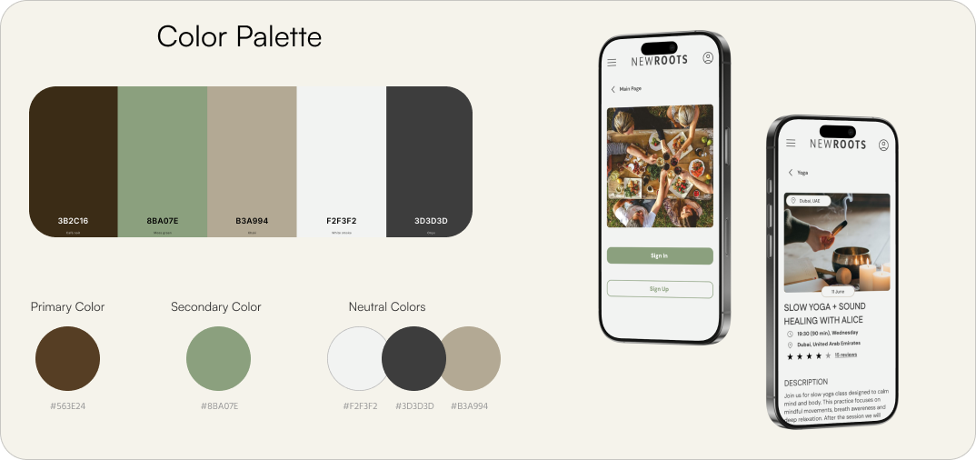
Colors – Café Noir brings stability and connection, Moss Green adds warmth and calmness, while neutrals create balance and harmony.
Typefaces – Fustat bridges tradition and modernity, while DM Sans and Poppins add clarity, simplicity, and warmth for digital use.
Logo – A circle of people holding hands, symbolizing community and support.
HIGH FIDELITY WIREFRAMES
At this stage, the ideas came to life. I refined the Sign In/Sign Up flow to make onboarding simple and welcoming, and the Book an Event flow to ensure discovering and joining activities felt effortless, turning NewRoots into a platform that supports both adaptation and connection.
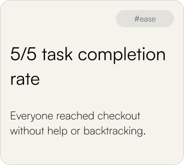
USABILITY FEEDBACK
Newcomers found joining and booking simple and motivating, with only small improvements needed for clearer feedback
Usability testing with 5 participants focused on two core flows - creating an account and booking a yoga class. The goal was to see how easily users could navigate and browse the platform and to identify areas that may require improvement.
All participants successfully completed both tasks, describing the experience as clear, smooth, and engaging. The sign-up flow was seen as simple and intuitive, while the event booking flow felt motivating, especially with the ability to browse by activity. Only minor refinements were noted, such as making some buttons more visible and improving confirmation feedback.
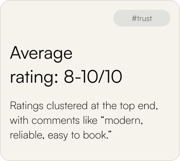
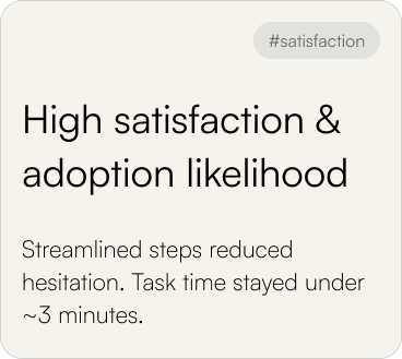
SUCCESS METRICS
ITERATION PRIORITIES
Overall, the experience was smooth and engaging, though subtle issues in clarity and visibility surfaced, guiding the next round of refinements.
Calendar redesign
2/5 participants found the current version confusing. A simpler, more familiar layout will make event booking smoother.
Language dropdown

Needs clearer labeling to reduce ambiguity and ensure users instantly understand their options.
Pagination vs. Show More
Users suggested switching to a “Show More” button for smoother browsing, which I plan to revisit in future iterations.
Yoga schedule clarity
Users suggested adding smaller icons with visible dates on the Yoga page to make schedules easier to scan.
FINAL DESIGN


FINAL PROTOTYPE
Through iterative testing and design refinements, the final prototype now captures the core journeys - creating an account and booking an event, making adaptation smoother, clearer, and more engaging!
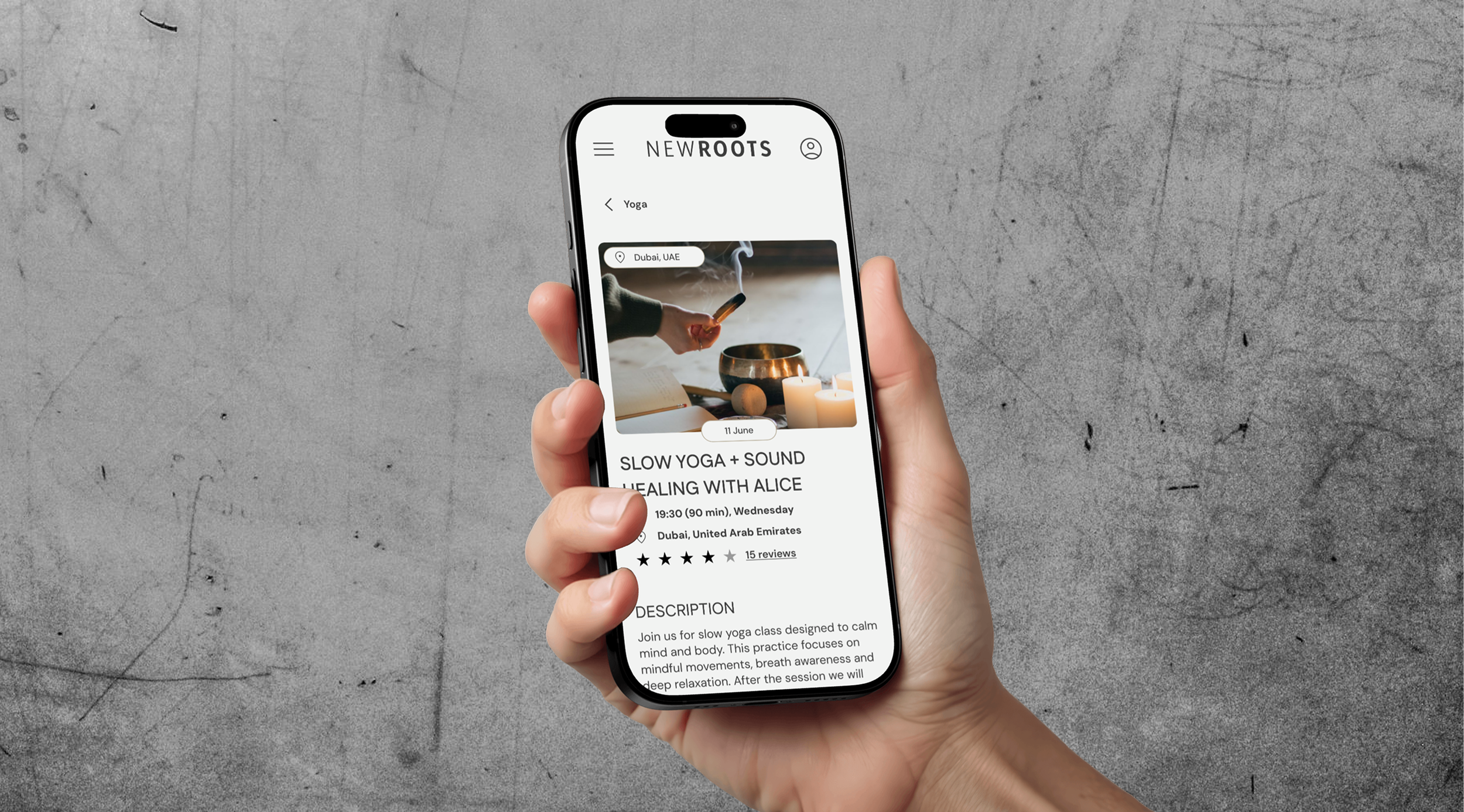
Book an Event
From the Events & Experiences section, users can easily browse and select activities that fit their interests. With clearer layouts and improved navigation, booking a class, like yoga, feels smooth, intuitive, and stress-free.
Sign In/Sign Up Process
The journey starts with the Sign In/Sign Up flow, where newcomers create an account and set up their profile. This streamlined process makes entering the platform simple and welcoming, helping users quickly access events and connect with the community.
REFLECTION
What I Learned:
Listening to newcomers’ stories reminded me how powerful it is to design beyond just functionality. Belonging, clarity, and connection are what really help people adapt in a new place.
Testing showed me that feedback isn’t criticism - it’s guidance. Each small comment (like “the calendar feels unclear”) pointed me toward a better, stronger solution.
If I Did This Again:
I’d conduct surveys or diary studies to capture even deeper insights into newcomers’ emotional journeys, not just user interviews.
I would explore different calendar and booking flows earlier in the process to validate which design feels the most natural.
I’d also add more visual warmth (photos, cultural elements, local voices) to help users feel connected to the community right from their first interaction.